For easy access to interior design, so many individuals now use Pinterest. Our example, Jessica, is just one of many. She’s an architect by profession but she’s already very satisfied with her own home that she gets to explore by switching things up on the inside. Jessica finds it soothing to move from one design concept to another while imagining how her room would look. Additionally, it's how she personally keeps up with emerging trends and the various components of good design. After hours of shopping, she came to one important conclusion: aesthetics is not only attractive to the sight but also helps create a smooth and ordered lifestyle.
It's comforting to see little groups of personal items since it gives a room a sense of home and shows that it may be inhabited. But having a tidy and lovely space also has the significant advantage of promoting clarity and serenity of mind. Additionally, if you keep your home tidy, you won't have to rush to get it ready for visitors from family and friends. It is already in good shape.
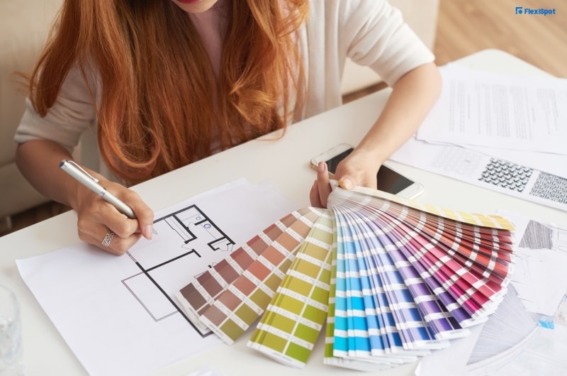
When Jessica is preparing to redecorate, she personally picks a color theme first. Picking items that work well together for the area is made simpler by sticking to a color scheme. She finds that mixing paint is also an experience because she never knows how it will turn out on the walls before she starts painting. She enjoys how surprising it is while still being fashionable and all-encompassing in the end result.
It is challenging to coordinate, match, arrange, and design colors in a manner that makes them appear pleasing and well put together. It is essential to be knowledgeable about the color wheel so that you can predict what will result from combining the colors assigned to be primary, secondary, and tertiary.
The three primary hues are red, yellow, and blue. The tertiary colors are created by combining the primary colors. Blue plus yellow is green, red plus blue is violet, and red plus yellow is orange.
You combine primary and secondary colors to create the six tertiary colors. These include red, yellow, orange, green, blue, violet, and yellow-green, to mention a few.
When using the color wheel in an application, you can mix and match colors without failing. Here are a few guidelines that Jessica follows:
A combination of complementary or contrasting elements.
Look at the two hues on the opposite sides of the color wheel. Anyone who enters the room will feel energized by the juxtaposition of these two striking hues, particularly if you bring them to their darkest or highest saturation levels.
Combination of the trio.
Colors on the color wheel that form a triangle are said to be equally spaced from one another. This color combination maintains harmony and has significant contrast, much like the first one that was stated. Any opacity you select will come off with a colorful finish.
Analogous color combination.
It is created when two to five or two to three colors are placed next to one another on the color wheel. This results in a visually appealing and peaceful environment. It would still largely resemble the colors in the color wheel regardless if you select subdued variations of those hues.
Mix of split complementary colors.
The colors in this combination make a triangle similarly to a complementary combo, however, it seems more obtuse and not equilateral. Combine two colors that are directly left and right of the complementary color to the primary colors you have chosen with one primary color. I'll give you an example. Red's complementary pair on the color wheel is green, which is the opposite if you chose the primary color red. To get the split-complementary hue for red, though, look at the left and right sides of the color green. You'll find blue-green and yellow-green there. These combinations have less potent effects than complementary combinations.
Tetrad arrangement.
When you look at a rectangle form inside the color wheel, you can determine this color. What distinguishes a rectangle from a circle? Choose two colors that are opposite one another on the color wheel, and then mix the colors that are on each color's left and right sides. As a result, a tetrad pattern and a rectangular shape are produced.
Combination encompassed in a square.
Place four colors on the color wheel on equal-sized sides. These hues work well together because they combine to provide vibrant, dramatic effects that are tone-different but still harmonious. Consider the color scheme of yellow-orange, red, green, and blue-purple, as an example. You can always experiment with the richness or opaqueness of the color if you don't like too dark hues in your room.
![]()
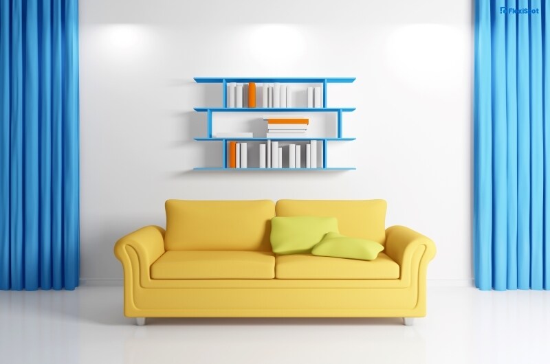
There’s also another side, a much safer one, and easier to stay true to the color palette. It helps that it has become trendy in recent years and has been a leading choice for homeowners and apartment residents. We’re talking about neutral colors. You can still have them in a color wheel and the rules above may still apply but in general, you just have to buy an item that is neutral in color. You can’t really go wrong with these hues as they’re easy to match with anything. The only rule probably is to not put in any color that’s too bold or it will stick out like an eyesore.
These neutral colors are matched with wood, glass, and greenery to give it more of that modern feel: clean and refreshing to the eyes. Most ergonomic furniture stick to this palette and will offer you colors that are subdued and saturated.
FlexiSpot is one brand that offers functional yet stylish ergonomic furniture that can make your aesthetic workspace happen. It’s easy to blend into your current workspace because the items look modern, clean, and sleek. They don’t come in bold colors and you would love to spruce them up with potted plants. If you want your workstation to stand out, you can of course inject personal touches that will make it unique.